Python Machine Learning: Scikit-Learn Tutorial
Python Machine Learning: Scikit-Learn Tutorial
Loading Your Data Set
You can typically find good data sets at the UCI Machine Learning Repository or on the Kaggle website. Also, check out this KD Nuggets list with resources.
The digits data set that comes with the Python library scikit-learn.
To load in the data, you import the module datasets from sklearn. Then, you can use the load_digits() method from datasets to load in the data:
from sklearn import datasets

# Load in the `digits` data
digits = datasets.load_digits()

# Print the `digits` data
print(digits)
In addition this data set is also available through the UCI Repository which you can download directly.
The data is already split up in a training and a test set, indicated by the extensions .tra and .tes.
import pandas as pd

# Load in the data with `read_csv()`
digits = pd.read_csv("http://archive.ics.uci.edu/ml/machine-learning-databases/optdigits/optdigits.tra", header=None)

# Print out `digits`
print(digits)
Explore Your Data
However, this tutorial assumes that you make use of the library's data
from sklearn import datasets

# Load in the `digits` data
digits = datasets.load_digits()
print(digits.keys())

dict_keys(['data', 'target', 'target_names', 'images', 'DESCR'])
import numpy as np

# Isolate the `digits` data
digits_data = digits.data

# Inspect the shape
print(digits_data.shape)

(1797, 64)

# Isolate the target values with `target`
digits_target = digits.target

# Inspect the shape
print(digits_target.shape)

(1797,)

# Print the number of unique labels
number_digits = len(np.unique(digits.target))

# Isolate the `images`
digits_images = digits.images

# Inspect the shape
print(digits_images.shape)

(1797, 8, 8)
All 1797 target values are made up of numbers that lie between 0 and 9.
Visualize Your Data Images With matplotlib
import matplotlib.pyplot as plt

# Figure size (width, height) in inches
fig = plt.figure(figsize=(6, 6))

# Adjust the subplots
fig.subplots_adjust(left=0, right=1, bottom=0, top=1, hspace=0.05, wspace=0.05)

# For each of the 64 images
for i in range(64):
    # Initialize the subplots: add a subplot in the grid of 8 by 8, at the i+1-th position
    ax = fig.add_subplot(8, 8, i + 1, xticks=[], yticks=[])
    # Display an image at the i-th position
    ax.imshow(digits.images[i], cmap=plt.cm.binary, interpolation='nearest')
    # label the image with the target value
    ax.text(0, 7, str(digits.target[i]))

# Show the plot
plt.show()
Python has a built-in function zip(*iterables) which makes an iterator that aggregates elements from each of the iterables.
>>> x = [1, 2, 3]
>>> y = [4, 5, 6]
>>> zipped = zip(x, y)
>>> list(zipped)
[(1, 4), (2, 5), (3, 6)]
>>> x2, y2 = zip(*zip(x, y))
>>> x == list(x2) and y == list(y2)
True
You can also visualize the target labels with an image
%matplotlib inline

# Import matplotlib
import matplotlib.pyplot as plt

# Join the images and target labels in a list
images_and_labels = list(zip(digits.images, digits.target))

# for every element in the list
for index, (image, label) in enumerate(images_and_labels[:8]):
    # initialize a subplot of 2X4 at the i+1-th position
    plt.subplot(2, 4, index + 1)
    # Don't plot any axes
    plt.axis('off')
    # Display images in all subplots
    plt.imshow(image, cmap=plt.cm.gray_r,interpolation='nearest')
    # Add a title to each subplot
    plt.title('Training: ' + str(label))

# Show the plot
plt.show()
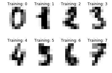
- the two numpy arrays are zipped together and save it into a variable called images_and_labels
- subplots in a grid of 2 by 4 are initialized
- images in all the subplots are displayed with a color map plt.cm.gray_r (which returns all grey colors) and the plotting of the axes is turned off.(“axes” refers to the axes part of a figure)
Visualizing Your Data: Principal Component Analysis (PCA)
The idea in PCA is to find a combination of features that capture well the variance of the original features.
This new variable or “principal component” can replace the two original variables.
In short, it’s a linear transformation method that yields the directions (principal components) that maximize the variance of the data.
You can easily apply PCA do your data with the help of scikit-learn:
from sklearn.decomposition import RandomizedPCA
from sklearn.decomposition import PCA

# Create a Randomized PCA model that takes two components
randomized_pca = RandomizedPCA(n_components=2)
# Fit and transform the data to the model
reduced_data_rpca = randomized_pca.fit_transform(digits.data)

# Create a regular PCA model
pca = PCA(n_components=2)
# Fit and transform the data to the model
reduced_data_pca = pca.fit_transform(digits.data)

# Inspect the shape
reduced_data_pca.shape

# Print out the data
print(reduced_data_rpca)
print(reduced_data_pca)
- you explicitly tell the model to only keep two components
Fitting finds the internal parameters of a model that will be used to transform data. Transforming applies the parameters to data. You may fit a model to one set of data, and then transform it on a completely different set.
fit_transform() is just doing both steps to the same data.
transform(X) applies dimensionality reduction to X, and returns X_reduced. transform(X, y) returns both X_reduced and y_pred.
This is a scikit example: You fit data to find the principal components. Then you transform your data to see how it maps onto these components:
from sklearn.decomposition import PCA

pca = PCA(n_components=2)

X = [[1,2],[2,4],[1,3]]

pca.fit(X)

# This is the model to map data
pca.components_

array([[ 0.47185791,  0.88167459],
       [-0.88167459,  0.47185791]], dtype=float32)

# Now we actually map the data
pca.transform(X)

array([[-1.03896057, -0.17796634],
       [ 1.19624651, -0.11592512],
       [-0.15728599,  0.29389156]])

# Or we can do both "at once"
pca.fit_transform(X)

array([[-1.03896058, -0.1779664 ],
       [ 1.19624662, -0.11592512],
       [-0.15728603,  0.29389152]], dtype=float32)
You can now build a scatterplot to visualize the data:
colors = ['black', 'blue', 'purple', 'yellow', 'white', 'red', 'lime', 'cyan', 'orange', 'gray']
for i in range(len(colors)):
    x = reduced_data_rpca[:, 0][digits.target == i]
    y = reduced_data_rpca[:, 1][digits.target == i]
    plt.scatter(x, y, c=colors[i])

plt.legend(digits.target_names, bbox_to_anchor=(1.05, 1), loc=2, borderaxespad=0.)
plt.xlabel('First Principal Component')
plt.ylabel('Second Principal Component')
plt.title("PCA Scatter Plot")
plt.show()
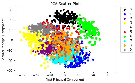
- A list of 10 colors, which is equal to the number of labels that you have. This way, you make sure that your data points can be colored in according to the labels.

留言