Matplotlib(Data Visualization) in Machine Learning
Matplotlib is a Python 2D plotting library.
For simple plotting the pyplot module provides a MATLAB-like interface, particularly when combined with IPython.
Tutorial
IPython
IPython provides a rich toolkit to help you make the most of using Python interactively.
- A powerful interactive Python shell
ipython
jupyter notebook
One major feature of the IPython kernel is the ability to display plots that are the output of running code cells.
To set this up, before any plotting or import of matplotlib is performed you must execute the magic command %matplotlib with:
- without an argument the output of a plotting command is displayed using the default matplotlib backend (for ex., GTK) in a separate window.
- inline This is available only for the Jupyter Notebook and the Jupyter QtConsole. With this backend, the output of plotting commands is displayed inline within frontends like the Jupyter notebook, directly below the code cell that produced it.
Image tutorial
This tutorial will use matplotlib's imperative-style plotting interface, pyplot.
Natively, Matplotlib only supports PNG images. The commands shown below fall back on Pillow library if the native read fails.
import matplotlib.pyplot as plt
import matplotlib.image as mpimg
import numpy as np

img = mpimg.imread('quote.png')

In [ ]:img.shape

(625, 625, 3)
Matplotlib has rescaled (normalized) the 8 bit data from each channel to float32 data type between 0.0 and 1.0.
The only datatype that Pillow can work with is uint8, image reading/writing for any format other than PNG is limited to uint8 data.
In [ ]:img.dtype

dtype('float32')

In [ ]:print(img)

[[[0.         0.         0.02352941]
  [0.         0.         0.02352941]
  [0.         0.         0.02352941]
  ...
  [0.19215687 0.20784314 0.27058825]
  [0.04313726 0.05882353 0.13333334]
  [0.01568628 0.03921569 0.10588235]]

 [[0.07450981 0.07450981 0.09803922]
  [0.05882353 0.05882353 0.07450981]
  [0.00784314 0.00784314 0.02745098]
  ...
  [0.1254902  0.13333334 0.21960784]
  [0.02745098 0.04705882 0.12941177]
  [0.01176471 0.03137255 0.10196079]]

 [[0.19607843 0.19607843 0.20392157]
  [0.15686275 0.15294118 0.16862746]
  [0.02352941 0.02352941 0.04705882]
  ...
  [0.03137255 0.03529412 0.12156863]
  [0.02352941 0.03137255 0.10588235]
  [0.01960784 0.03137255 0.09019608]]

 ...

 [[0.         0.         0.02352941]
  [0.         0.         0.02352941]
  [0.         0.         0.02352941]
  ...
  [0.29411766 0.32156864 0.49411765]
  [0.25490198 0.28627452 0.47058824]
  [0.23921569 0.27450982 0.4509804 ]]

 [[0.         0.00392157 0.02352941]
  [0.         0.         0.02352941]
  [0.         0.         0.02352941]
  ...
  [0.32156864 0.33333334 0.4745098 ]
  [0.23137255 0.25490198 0.41568628]
  [0.20784314 0.23921569 0.39607844]]

 [[0.         0.         0.02352941]
  [0.         0.00392157 0.02745098]
  [0.00392157 0.00784314 0.02745098]
  ...
  [0.3019608  0.3137255  0.44313726]
  [0.22352941 0.24705882 0.39215687]
  [0.2        0.22745098 0.3764706 ]]]
Each inner list represents a pixel. Here, with an RGB image, there are 3 values.
We can use imshow() function to render the numpy array.
imgplot = plt.imshow(img)
MATPLOTLIB(DATA VISUALIZATION) in Machine Learning
matplotlib is probably the single most used Python package for 2D-graphics. It provides both a very quick way to visualize data from Python and publication-quality figures in many formats.
Install
Matplotlib and most of its dependencies are all available as wheel packages for macOS, Windows and Linux distributions:
python -mpip install -U pip
python -mpip install -U matplotlib
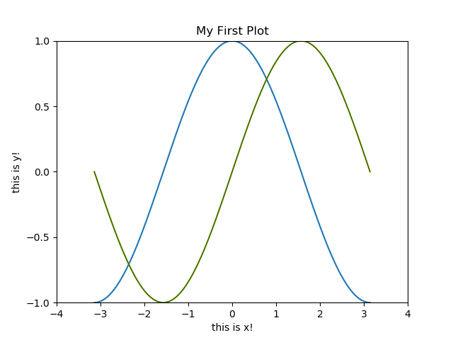
Regular Plot
Plot lines or matrixes.
To draw the cosine and sine functions
import numpy as np
import matplotlib.pyplot as plt

X = np.linspace(-np.pi, np.pi, 256,endpoint=True) # 256 values ranging from -π to +π (included)
C,S = np.cos(X), np.sin(X) # C is the cosine (256 values) and S is the sine (256 values).
plt.plot(X,C)
plt.plot(X,S)

# Plot sine using green color with a continuous line of width 1 (pixels)
plt.plot(X, S, color="green", linewidth=1.0, linestyle="-")

# Set x limits
plt.xlim(-4.0, 4.0)
# Set y limits
plt.ylim(-1.0, 1.0)

# Set x ticks
plt.xticks(np.linspace(-4,4,9,endpoint=True))

# Set y ticks
plt.yticks(np.linspace(-1,1,5,endpoint=True))

plt.xlabel('this is x!')
plt.ylabel('this is y!')

plt.title('My First Plot')
plt.legend(loc='upper left', frameon=False)

plt.show()
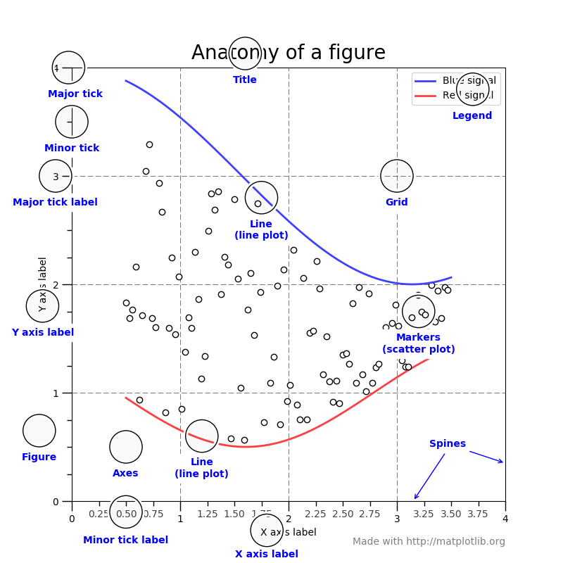
Figures, Subplots, Axes and Ticks
A figure in matplotlib means the whole window in the user interface.
Within this figure there can be subplots.
Figures
A figure is the windows in the GUI that has "Figure #" as title. Figures are numbered starting from 1There are several parameters that determine what the figure looks like:
| Argument | Default | Description |
|---|---|---|
| num | 1 | number of figure |
| figsize | figure.figsize | figure size in in inches (width, height) |
| dpi | figure.dpi | resolution in dots per inch |
| facecolor | figure.facecolor | color of the drawing background |
| edgecolor | figure.edgecolor | color of edge around the drawing background |
| frameon | True | draw figure frame or not |
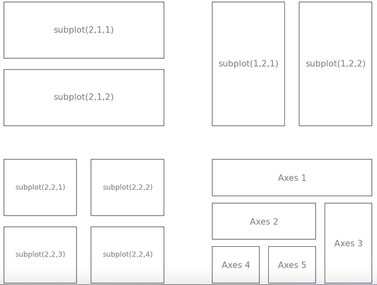
Subplots and Axes
With subplot you can arrange plots in a regular grid. You need to specify the number of rows and columns and the number of the plotAxes are very similar to subplots but allow placement of plots at any location in the figure.
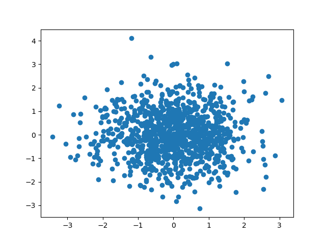
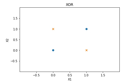
Scatter(2D) Plot
import numpy as np
import matplotlib.pyplot as plt

n = 1024
X = np.random.normal(0,1,n)
Y = np.random.normal(0,1,n)

plt.scatter(X,Y)
plt.show()
import numpy as np
import matplotlib.pyplot as plt

plt.scatter([0,1], [0, 1], marker="o")
plt.scatter([0,1], [1, 0], marker="x")

plt.xlim(-1.0, 2.0)
plt.ylim(-1.0, 2.0)
plt.xticks(np.linspace(-0.5, 1.5,5,endpoint=True))
plt.yticks(np.linspace(-0.5, 1.5,5,endpoint=True))
plt.xlabel('X1')
plt.ylabel('X2')
plt.title('XOR')
plt.show()
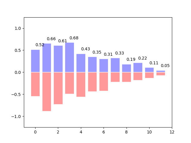
Bar Plots
import numpy as np
import matplotlib.pyplot as plt

n = 12
X = np.arange(n)
Y1 = (1-X/float(n)) * np.random.uniform(0.5,1.0,n)
Y2 = (1-X/float(n)) * np.random.uniform(0.5,1.0,n)

plt.bar(X, +Y1, facecolor='#9999ff', edgecolor='white')
plt.bar(X, -Y2, facecolor='#ff9999', edgecolor='white')

for x,y in zip(X,Y1):
    plt.text(x+0.4, y+0.05, '%.2f' % y, ha='center', va= 'bottom')

plt.ylim(-1.25,+1.25)
plt.show()
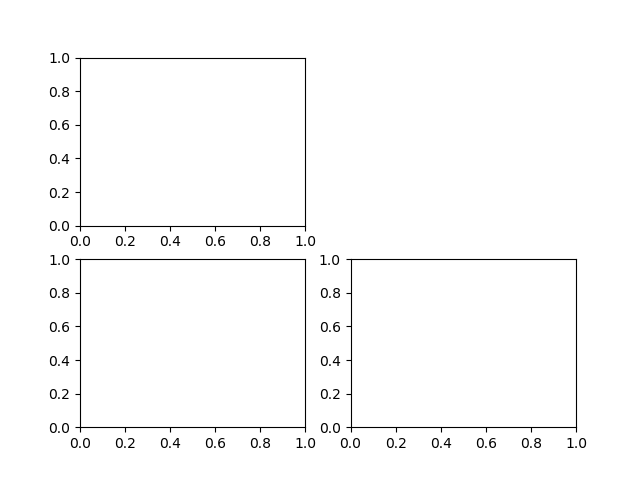
Multi Plots
import numpy as np
import matplotlib.pyplot as plt

plt.subplot(2,2,1)
plt.subplot(2,2,3)
plt.subplot(2,2,4)

plt.show()
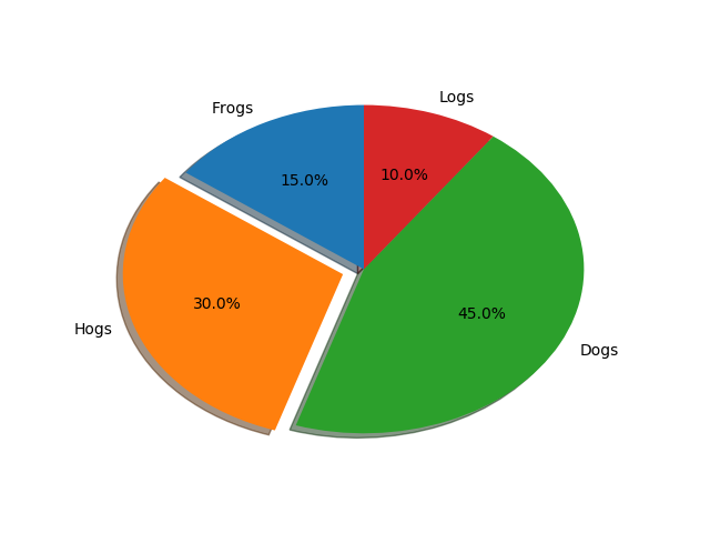
Pie Plots
# Pie chart, where the slices will be ordered and plotted counter-clockwise:
labels = 'Frogs', 'Hogs', 'Dogs', 'Logs'
sizes = [15, 30, 45, 10]
explode = (0, 0.1, 0, 0)  # only "explode" the 2nd slice (i.e. 'Hogs')
plt.pie(sizes, explode=explode, labels=labels, autopct='%1.1f%%',
        shadow=True, startangle=90)
plt.show()
Saving Figures
### bitmap format
plt.plot(x, sinus)
plt.savefig("sinus.png")
plt.close()

# SVG format
plt.plot(x, sinus)
plt.savefig("sinus.svg")
plt.close()

# Or pdf
plt.plot(x, sinus)
plt.savefig("sinus.pdf")
plt.close()

留言