Web UI
HTML5 and JavaScript Web Apps
Bridging the Gap between the Web and the Mobile Webby Wesley Hales
Preface
The examples in this book are maintained at http://github.com/html5e
CHAPTER 1
Client-Side Architecture
Before HTML5
More Code on the Client
The Browser as a Platform
HTML5, the Open Web, and mobile devices have helped push the browser-as-a-platform forward, giving browsers the capabilities of storing data and running applications in an offline state.CHAPTER 2 The Mobile Web
The Mobile Web refers to browser-based applications created for mobile devices, such as smartphones or tablets, which can be connected wirelessly.
Mobile First
Deciding What to Support
When you use HTML5’s core APIs, you’re bound to the features that are supported by your target device.
We must now create applications to be compatible across browsers, platforms, and devices. You’re not only supporting browsers, but the operating system the browser is tied to as well.
You can find the latest matrix of HTML5 support across all rendering engines on the HTML5 engine comparison page on Wikipedia.
| Engine | Status | Embedded in |
| WebKit | Active | Safari browser, plus all browsers hosted on the iOS App Store |
| Blink | Active | Google Chrome and all other Chromium-based browsers such as Opera and Microsoft Edge |
| EdgeHTML | Active | Universal Windows Platform apps; formerly in the Edge browser |
| Gecko | Active | Firefox browser and Thunderbird email client, plus forks like SeaMonkey and Waterfox |
| KHTML | Discontinued | Konqueror browser |
| Presto | Discontinued | formerly in the Opera browser |
| Trident | Discontinued | Internet Explorer browser and Microsoft Outlook email client |
Mobile Web Browsers
Mobile Browser Market Share
Browser Grading
HTML5 in the Enterprise
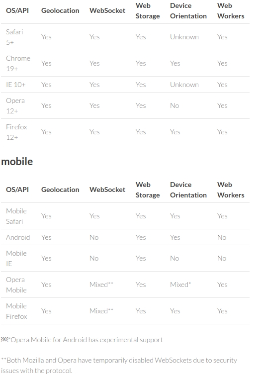
With a clearer picture of the mobile device and browser landscape, you next need to determine which W3C specifications the various browsers support and how you can use them today.
html5e is a term , it stands for HTML5 Enterprise and is an identifier for the 5 specifications
- Web Storage
- Web Socket
- Geolocation
- Orientation
- Web Workers
Graceful Degradation
QA and Device Testing
The best way to test your mobile HTML5-based application is to use the actual physical device you are targeting (or an emulator).
3. Building for the Mobile Web
Mobile Web Look and Feel
The success of any mobile web application relies on two factors:
- design a consistent look and feel across all platforms.
- performance offline capabilities, animations on the UI, and back‐end services that retrieve and send data via RESTful or WebSocket endpoints.
With HTML5, WORA (Write Once, Run Anywhere) basically means you can use standard JavaScript and CSS to access all of the device features that a native application can (the device GPS, camera, accelerometer, etc.).
To truly achieve that native look and feel, not only does your app need to respond quickly, but it must also look good.
The Look
The book "Mobile Design Pattern Gallery: UI Patterns for Mobile Applications" provides a handy reference to 70 mobile app design patterns, illustrated by more than 400 screenshots from current iOS, Android, BlackBerry, WebOS, Windows Mobile, and Symbian apps.
The Feel
Ideally, you want the mobile device CPU to set up the initial animation, and then have the GPU responsible for only compositing different layers during the animation process. This is what translate3d , scale3d , and translateZ do: they give the animated elements their own layer, thus allowing the device to render everything together smoothly.
Interactions and Transitions
Preliminary:- HTML <div> Tag The <div> tag defines a division or a section in an HTML document. The <div> element is often used as a container for other HTML elements to style them with CSS or to perform certain tasks with JavaScript. The <div> element is very often used together with CSS, to layout a web page. The <div> tag also supports the Global Attributes in HTML. The <div> tag also supports the Event Attributes in HTML.
- The class Attribute The HTML class attribute is used to define equal styles for elements with the same class name. So, all HTML elements with the same class attribute will get the same style.
- HTML <nav> Tag The <nav> tag defines a set of navigation links. The purpose for these tags is more for a Semantic HTML. It strengthens the meaning of the information in webpages/web apps, and not just about the style or presentation.
- Viewport The viewport is the user's visible area of a web page. HTML5 introduced a method to let web designers take control over the viewport, through the <meta> tag. You should include the following <meta> viewport element in all your web pages:


<meta name="viewport" content="width=device-width, initial-scale=1.0">
- The width=device-width part sets the width of the page to follow the screen-width of the device (which will vary depending on the device).
- The initial-scale=1.0 part sets the initial zoom level when the page is first loaded by the browser.
<!DOCTYPE html>
<html lang="en">

<head>
<title>HTML5 Architecture</title>
<meta http-equiv="Content-Type" content="text/html; charset=utf-8"/>
<meta name="viewport" content="width=device-width, minimum-scale=1.0, maximum-scale=1.0"/>
<!-- enable full-screen mode -->
<meta name="apple-mobile-web-app-capable" content="yes"/>
<!-- controls the appearance of the status bar in full-screen mode -->
<meta name="apple-mobile-web-app-status-bar-style" content="black"/>
<link rel="stylesheet" media="all" href="demo.css" />
<link rel="stylesheet" media="all" href="../slidfast.css" />
</head>
<body>
<div id="browser">
    <nav class="primary">
        <ul>
            <li><a href="#sf-home-page" onclick="slidfast.ui.slideTo('home-page')">Home</a></li>
            <li><a href="#sf-products-page" onclick="slidfast.ui.slideTo('products-page')">Products</a></li>
            <li><a href="#sf-about-page" onclick="slidfast.ui.slideTo('about-page')">About</a></li>
            <li id="flip-button"><a href="#sf-contact-page" onclick="slidfast.ui.flip('contact-page')">Contact</a></li>
        </ul>
    </nav>

    <div id="page-container">

        <div id="front" class="normal">

            <div id="home-page" class="page">
                <h1>Home Page</h1>
                <a href="demo/home-detail.html" class="fetch">Find out more about the home page!</a>
            </div>

            <div id="products-page" class="page stage-right">
                <h1>Products Page</h1>
                <a href="demo/product-listing.html" class="fetch">We got some product listings fer ya!</a>
            </div>

            <div id="about-page" class="page stage-left">
                <h1>About Page</h1>
                <a href="demo/about-cto.html">You know you want to know more about us!</a>
            </div>
        </div>
        <div id="back" class="flipped">

            <div id="contact-page" class="page">
                <h1>Contact Page</h1>
                <a href="demo/contact-map.html" class="fetch">Check out our map!</a>
            </div>

        </div>

    </div>
</div>
<script type="text/javascript" src="../slidfast.js"></script>
<script type="text/javascript">

    slidfast({
        defaultPageID:'home-page',
        touchEnabled: false,
        singlePageModel: true,
        optimizeNetwork: true
    });

//hide the flip functionality on certain devices/browsers
var ua = navigator.userAgent.toLowerCase();
var hidestuff = ua.indexOf("android") > -1 || ua.indexOf("opera") > -1  || ua.indexOf("fennec") > -1;
if(hidestuff) {
  //hide any 360 flip stuff
  document.querySelector("#back").style.display = 'none';
  document.querySelector("#flip-button").style.display = 'none';
}
</script>
</body>
</html>
Sliding
The slide transition is invoked to bring a new content area into the view port.
- css/demo.css
#home-page {
    background-color: #6495ed;
}

#products-page {
    background-color: #a52a2a;
}

#about-page {
    background-color: #006400;
}

#contact-page {
    background-color: #ff1493;
    width: 100%;
    height: 100%;
}
#back,
#front {
    position: absolute;
    width: 100%;
    height: 100%;
    -webkit-backface-visibility: hidden;
    -webkit-transition-duration: .5s;
    -webkit-transform-style: preserve-3d;
    -moz-backface-visibility: hidden;
    -moz-transform-style: preserve-3d;
    -moz-transition-duration: .5s;
    -o-backface-visibility: hidden;
    -o-transform-style: preserve-3d;
    -o-transition-duration: .5s;
}

.normal {
    -webkit-transform: rotateY(0deg);
    -moz-transform:  rotateY(0deg);
    -o-transform:  rotateY(0deg);
}


#page-container {
    position:absolute;
    width:100%;
    height: 100%;
    overflow: hidden;
}

.page {
    position: absolute;
    width: 100%;
    height: 100%;
    /*top: 0;*/
    background-color: #fff;
    /*activate the GPU for compositing each page */
    /*-webkit-transform: translate3d(0, 0, 0);*/
}

.stage-left,
.stage-right{
    height:100%;
    overflow: hidden;
}

.stage-left {
    left: -100%;
}

.stage-right {
    left: 100%;
}
Flipping
Rotating
Debugging Hardware Acceleration
Memory Consumption
Fetching and Caching
Network Type Detection and Handling
Frameworks and Approaches
Single Page
No Page Structure
100% JavaScript Driven
Mobile Debugging
CHAPTER 5 WebSockets
WebSockets give you minimal overhead and a much more efficient way of delivering data to the client and server with full duplex communication through a single socket.
Building the Stack
On the Server, Behind the Scenes
Programming Models
Relaying Events from the Server to the Browser
Binary Data Over WebSockets
Managing Proxies
Frameworks
Head First HTML5 Programming
building web apps with javascript
by
Eric Freeman
Elisabeth Robson

留言